Smart Web UKWORKBENCH · Straightforward websites for small UK teams
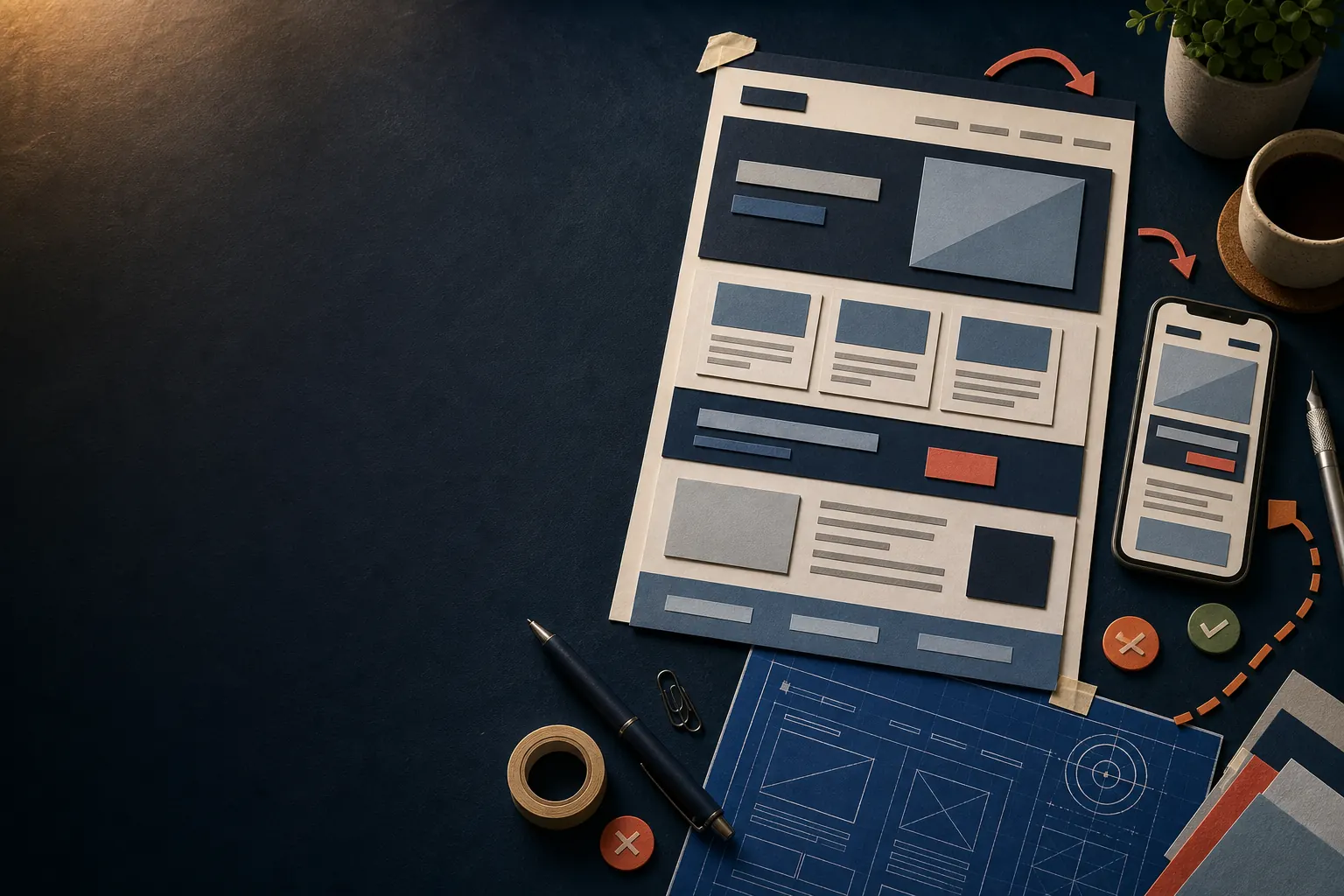
Website planning workshop with page layouts and notes
WORKSHOP / 01

Website planning and launch support

A clearer small-business website, built around the next step.

Plan a useful new website without agency fog. We shape the pages, words and contact journey around what customers actually need to understand.

Email us about your next step
PLAN · SHAPE · LAUNCH

Plan the work on paper first.

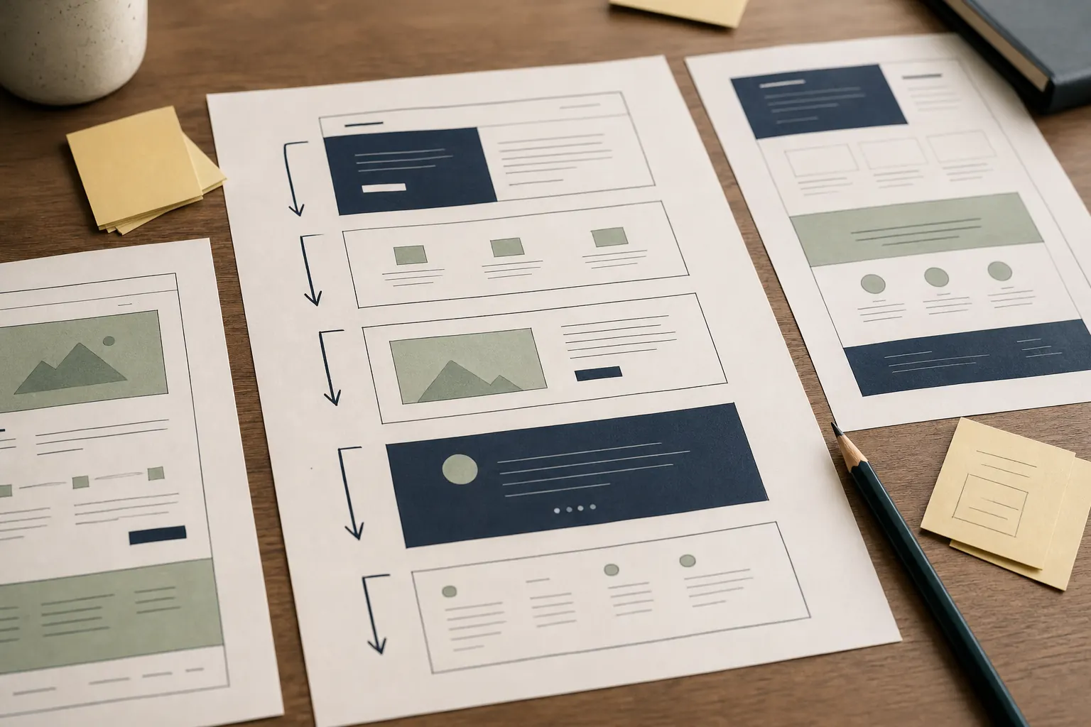
Website planning sheets arranged on a workshop desk
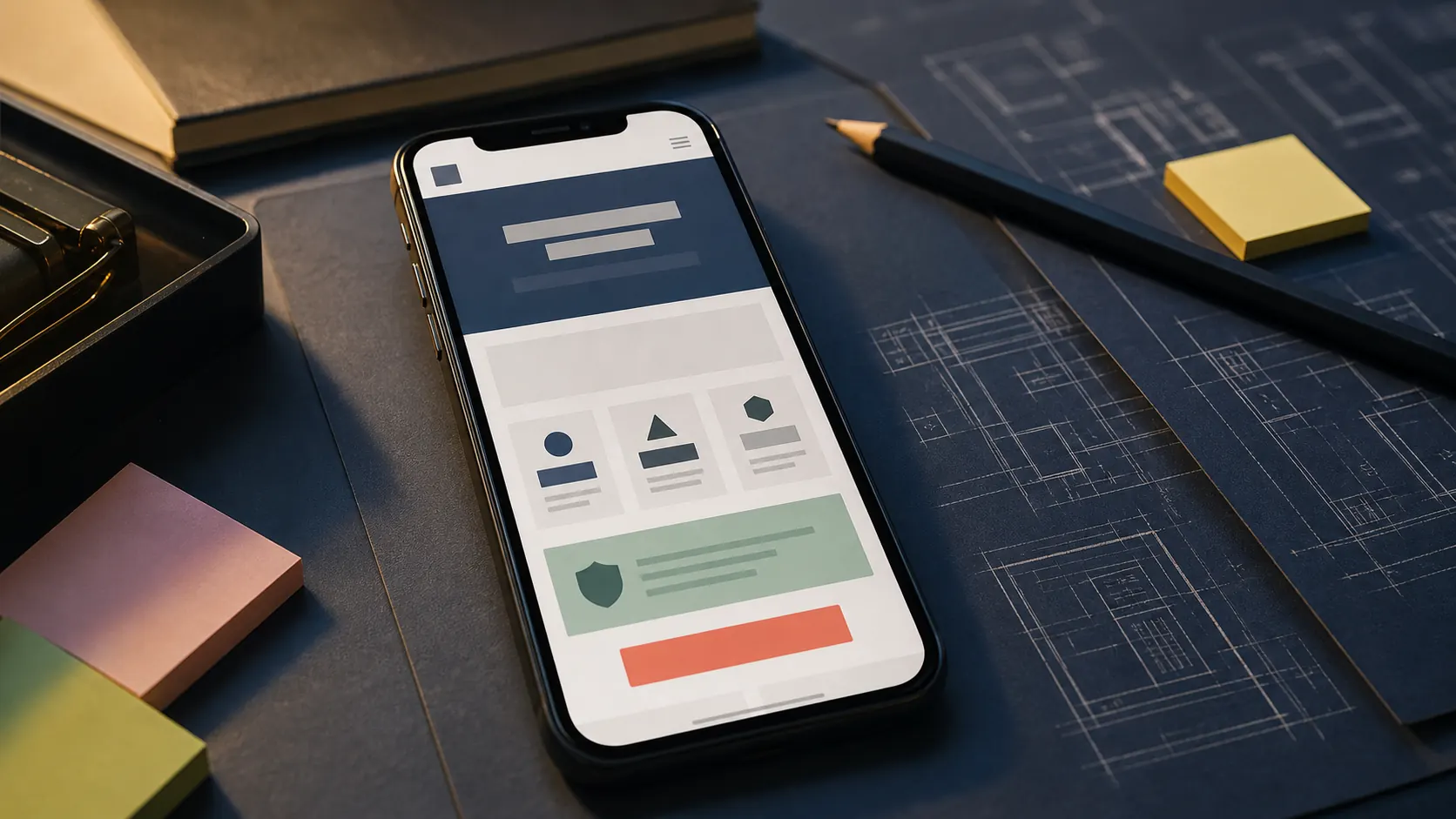
Mobile website layout shown beside planning notes
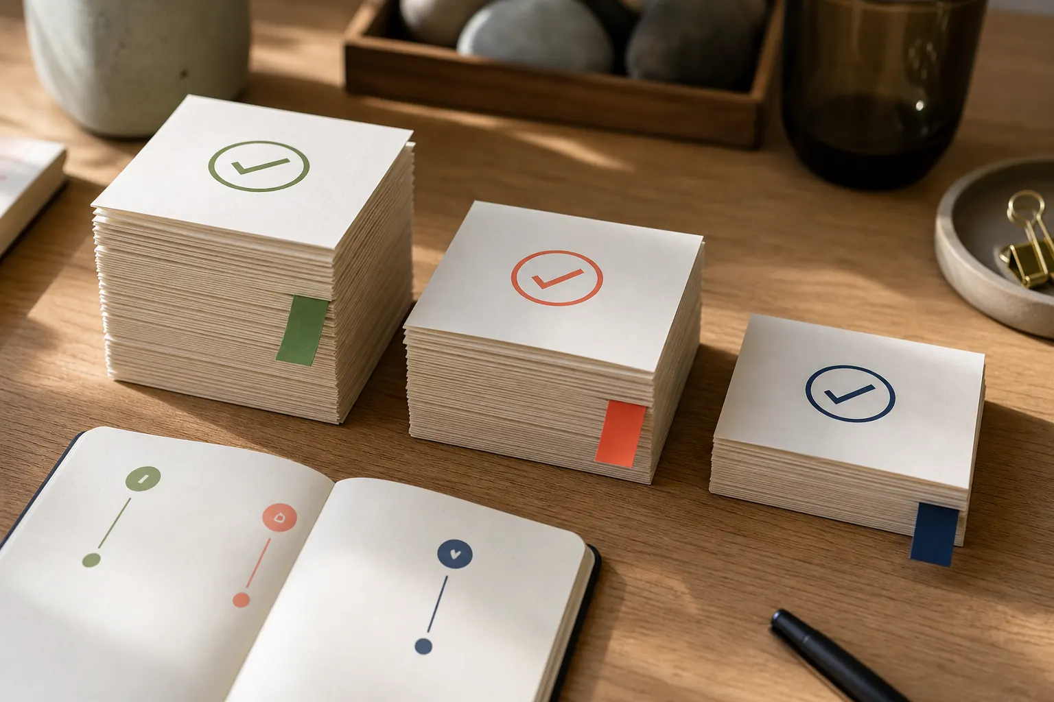
Prioritised website launch notes
Unclip the planning notes

Why a new website can feel harder than it should

Read the note

A new site often starts with a list of colours and features before anyone has agreed what a visitor needs to learn. We begin with the business offer, service area, common questions and one clear contact route. That gives every later choice a purpose. Owners can see which pages deserve attention and which ideas can wait. The result is a manageable brief rather than a growing wish list, with language that sounds like the business rather than a software catalogue.

The questions worth answering before design begins

Read the note

We inspect the raw material: services, customer questions, useful photographs, trading details and the way enquiries are handled. This is not a search audit or a maintenance check. It is preparation for a new small-business website. Gaps become a short collection list, so the project is not delayed by missing wording or uncertain responsibilities. Decisions are recorded plainly and the owner can approve the shape before detailed page work starts.

Structure / mobile / action

Turn scattered ideas into a page journey

Read the note

The blueprint puts a clear promise first, follows it with useful service detail, answers reasonable doubts and ends with a contact invitation. On a multi-page site, each service receives enough space to explain scope without repeating the homepage. The diagram beside this copy shows a generic before-and-after structure. It is explanatory, not evidence of a customer result, and helps owners discuss hierarchy without needing design vocabulary.

Make the opening phone screen do useful work

Read the note

A visitor on a phone should see what the business does, who it helps and how to make contact without searching through a menu. We keep the main heading readable, make the email action easy to tap and avoid squeezing a desktop composition into a narrow screen. Images support the message instead of pushing it away. Longer detail remains available lower down for people who want to compare services carefully.

Agree the structure before polishing the surface

Read the note

First we collect the essentials and settle the audience. Next we arrange the pages and write a plain first version. Then the visual system is applied consistently across large and small screens. You see the work before publication and can identify factual corrections. Launch is treated as a controlled handover: contact links, legal pages, headings and key journeys are checked, while future edits are explained in language a small team can retain.

A sensible foundation for an owner-managed firm

Read the note

The starter scope is designed for a business that needs a credible web home rather than a complicated platform. It covers page planning, clear service wording, responsive presentation, contact links, privacy information and basic search-friendly structure. Optional needs are separated rather than quietly expanding the job. Email the current position and intended launch; the reply will focus on whether this approach fits and what information would be needed next.

What leaves the workshop

See the kind of planning material used

Read the note

The gallery shows illustrative planning sheets: a homepage order, notes for the first mobile view and a prioritised launch list. They show the form of useful outputs, not work completed for a named customer. Your material would be based on your real offer and checked facts. Keeping the outputs simple makes them useful after launch, when a new service, image or paragraph needs to be placed without weakening the original hierarchy.

Move from idea to launch without hidden leaps

Read the note

The sequence is deliberately visible: define the job, gather accurate material, agree the page map, shape the words, apply the design, check the contact journey and prepare the handover. Each stage reduces uncertainty for the next. If an essential fact is missing, it is flagged rather than invented. If a requested feature does not help the agreed purpose, it can be postponed. That keeps the first release focused and easier to maintain.

What owners usually want clarified

Read the note

You do not need finished copy before making contact; a service list and honest explanation are enough to begin. Existing photos can be assessed for relevance, but generic imagery is not presented as customer proof. Search visibility depends on many factors, so the site is built with sound structure rather than promises about positions. Nothing is published without agreement, and access details should never be sent in an ordinary first email.

Lift the final note

Start with the business, not a feature list

Read the note

Email what the business does, the area it serves, whether a domain already exists and the main action a visitor should take. Include a preferred launch window if there is one, but do not send passwords or private customer information. We will reply with a straightforward view of the next planning step. A useful website begins with a clear job and accurate material; the contact note is enough to start that conversation.